Pete_Murphy
New member
- Joined
- Feb 4, 2021
- Messages
- 1
- Reaction score
- 0
- Points
- 0
- Excel Version(s)
- 365 and 2016 (home and work)
Hi all, just want to say thanks in advance for any help offered to my problem.
Please help me on making a graph. I thought this would be easy and kind of showed off at work to say I knew what I was doing but am failing hard.
OK, here is what I am trying to do.
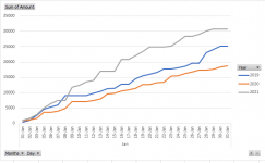
Make a cumulative line graph comparing a series of values from Jan 2019, Jan 2020 and Jan 2021.
The data has the following characteristics.
(1) On some days there are multiple entries
(2) On some days there are no entries
(3) The data is daily entries, not cumulative (which is what I need for my graphs)
(4) I have date and value for January in the three years.
I think that's about it. I quickly in PowerPoint made an example idea of what I am looking for to hopefully give some insight as to what I am after.
I also attach a random generated sample file in Excel to show what my data looks like.
I really thought this would be easy, ideally I would like to see a tutorial where I can learn how to do this myself, but I am reasonable at Excel (at least I thought so ) so could probably follow instructions or replicate if anyone is able to edit my file.
As I said at the start, many thanks in advance to the group for any help provided...
Please help me on making a graph. I thought this would be easy and kind of showed off at work to say I knew what I was doing but am failing hard.
OK, here is what I am trying to do.
Make a cumulative line graph comparing a series of values from Jan 2019, Jan 2020 and Jan 2021.
The data has the following characteristics.
(1) On some days there are multiple entries
(2) On some days there are no entries
(3) The data is daily entries, not cumulative (which is what I need for my graphs)
(4) I have date and value for January in the three years.
I think that's about it. I quickly in PowerPoint made an example idea of what I am looking for to hopefully give some insight as to what I am after.
I also attach a random generated sample file in Excel to show what my data looks like.
I really thought this would be easy, ideally I would like to see a tutorial where I can learn how to do this myself, but I am reasonable at Excel (at least I thought so
As I said at the start, many thanks in advance to the group for any help provided...


