VBA That Colors Bars in a Bar Chart Based on DataPoint Name

bauer32

New member
Joined
Jul 24, 2019
Messages
3
Reaction score
0
Points
0
Excel Version(s)
Microsoft Excel 2010
I have a bar chart that fluctuates depending on how many datapoint values I have. If there is a datapoint that doesn't have a value, I have a macro that hides that row with the blank values, which then condenses my graph. That way my graph can have 2 to 15 datapoint values. The issue I am having is I want datapoint#1 to be a gradient fill that has 3 stops (0%, 50%, 100%, with no angle) colored black, datapoint#2 to be orange, datapoint#3 to be green, and so on. If I pre-set the bar colors 1-15, and I don't have datapoint#2, then datapoint#3 will be colored with datapoint#2's color (orange instead of green). Wondering if there is a way to write a macro that will color the bars based on the datapoint name so the colors will remain stagnant no matter how many values I have in the graph. I have attached the spreadsheet as an example.View attachment Template.xlsmView attachment Template.xlsm
 
This can get complicated.
Did you mean not to plot row 45 (DataPoint#11, Yellow)?
 
This can get complicated.
Did you mean not to plot row 45 (DataPoint#11, Yellow)?


Thanks for responding! Basically, I need help writing something that will color the bars in the chart based on the Data Point name (Ex. If DataPoint#11 Then color gradient fill yellow, 0% & 100% stops (RGB) 97, 67, 0; 50% stop (RGB) 209, 144, 0). I found a video where someone put in code that randomly assigned colors to all of the bars but wondering if there is a way to assign colors based on which data points have values that are being shown in the graph and based on that data point name. Hope this makes sense. To answer your question, DataPoint#11 is plotted on the graph and is the last bar in the bar chart on the right. If you select the unhide button, the datapoint#11 fill goes from being yellow to a light green. Trying to make sure that the datapoint#11 bar always stays yellow, no matter it's position on the graph. Thanks!
 
To answer your question, DataPoint#11 is plotted on the graph and is the last bar in the bar chart on the right
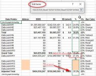
That's Adjusted Total on row 51. You have excluded DataPoint#11. I want to make sure that you have this right because to determine in VBA what ranges on a chart are plotted can be difficult, especially so in this case because you're already plotting non-contiguous ranges before you decide not to plot some points by hiding some of those rows.
2019-07-25_160341.jpg

I need to determine what ranges are being plotted so that I can grab your colour from the same rows in column X
 
Last edited:
No it's not, that's Adjusted Total on row 51. You have excluded DataPoint#11. I want to make sure that you have this right because to determine in VBA what ranges on a chart are plotted can be difficult, especially so in this case because you're already plotting non-contiguous ranges before you decide not to plot some points by hiding some of those rows.


I'm very sorry, you are correct. Without my normal data labels I was looking at it incorrectly and also labeled it incorrectly. I did mean to exclude DataPoint#11, the Adjusted Total (row 51) should have been labeled as a datapoint. The Adjusted Total (row 51) should be colored yellow instead of DataPoint#11. Thanks!
 
The attached is very much work-in-progress in that there are few checks made in the code so it can very easily go wrong. Hopefully your coding skills will add that aspect.
I changed your colour table to be a single block (instead of two) and made each entry one row each.
The code (Macro2) runs after every hide/unhide operation.
Play with it, changing the colours in column X.
It's fragile.
 

Attachments

  • ExcelGuru10126Template.xlsm
    34.7 KB · Views: 8
Back
Top