Hello,
I have this problem getting my values to plot in a dot chart in the way I want and I cannot solve it for the love of my life. I hope someone can help me!
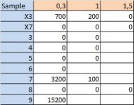
I have a table with data that looks like this:

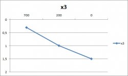
Blue being the sample names and orange the depths (in meter) where I have found the number of animals I've noted in the cell. The thing is I want to plot my chart in a way so that I have the depths on the y-axis from the top down, so that I start at 0 m going down to 2 m. And on the x-axis I want the numbers to be plotted from 0 where x and y cross, and the maximum number on myt right hand side, something like this:

But I've got the numbers on my x-axis wrong, cause I want it to start with 0 on the left hand side, naturally... And I only achieved this by writing x values where y should be and the other way round, and that is not possible when I want to plot all 9 series... I hope someone can help me!!! I've asked around but noone seems to get how to do this, but then we are all just normal excel-users, no experts...
Thank you!"!!!
/Lisa
I have this problem getting my values to plot in a dot chart in the way I want and I cannot solve it for the love of my life. I hope someone can help me!
I have a table with data that looks like this:

Blue being the sample names and orange the depths (in meter) where I have found the number of animals I've noted in the cell. The thing is I want to plot my chart in a way so that I have the depths on the y-axis from the top down, so that I start at 0 m going down to 2 m. And on the x-axis I want the numbers to be plotted from 0 where x and y cross, and the maximum number on myt right hand side, something like this:

But I've got the numbers on my x-axis wrong, cause I want it to start with 0 on the left hand side, naturally... And I only achieved this by writing x values where y should be and the other way round, and that is not possible when I want to plot all 9 series... I hope someone can help me!!! I've asked around but noone seems to get how to do this, but then we are all just normal excel-users, no experts...
Thank you!"!!!
/Lisa

